
CASE STUDY
CASE STUDY
Overview
Truckstop Go was built as the company’s first native mobile app, replacing an outdated web-based tool with a modern, on-the-go experience. I guided the UX foundation, establishing a Flutter-based design library, shaping the load search workflow, and designing in-app feedback guides.
The result was rapid adoption: 60,000 carriers in the first month and 150,000+ within the first year. Truckstop Go quickly became one of the fastest-delivering product teams, setting a new standard for mobile at Truckstop.
| Role | Senior Product Designer |
| Team | Truckstop Product + external engineer partner |
| Timeline | 2021–2022 |
| Focus | Product design, UX/UI guidance, feature prioritization, establishing parity with desktop, and creating a usable mobile-first foundation |
Problem
By 2019, Truckstop’s mobile presence was limited to a dated web-based app. It lacked key features, was clunky to use, and gave carriers little reason to trust it in their day-to-day work. Meanwhile, competitors were racing ahead with polished native apps. Carriers, many of whom run their businesses on the road, needed a better way to find and manage loads.
Truckstop Go became our answer. It was conceived as the company’s first native iOS and Android application, built to carry forward Truckstop’s 25 years of experience while giving carriers a mobile-first foundation they could actually rely on.
Original Web App

Native Redesign

The Challenge
The challenge wasn’t just to create “an app.” It was to replace a dated web-based product with a native experience carriers would adopt and trust, while delivering parity for the core load board features they relied on daily: authentication, dashboard, search, load details, and posting.
Before our external engineering partner began development, I worked to set the project up for success. I established a Flutter-based material library and guidelines for a mobile pattern library. This gave the team a strong design baseline, helping us move quickly while ensuring consistency and alignment with Truckstop’s brand standards.

Demographics & Persona
Research and survey data gave us a clear picture of Truckstop’s carrier base.
Key demographics:
-
- Most carriers are men between 35 and 54 years old
- A large share are owner-operators, often single-truck businesses
- Many have 6+ years of industry experience
- Mobile adoption is strong, with smaller fleets using apps daily to find loads
- Common concerns include fuel costs, fair rates, broker trust, and reliable information
From this, we created composite personas to humanize the data. One of the most representative was the independent owner-operator.

Design Cadence
Working with an external partner meant speed was both our advantage and our risk. To keep the project steady, I set a weekly rhythm that became the key to success.
- Mon: Stakeholder Review
- Tue: Design Sync
- Wed: Working Session
- Thu: SME Feedback
- Fri: Library Updates
I was also active in major scrum practices: sprint planning, refinement, retros, and testing across two-week sprints. Balancing this alongside four other development teams required careful prioritization, but it helped establish a strong, repeatable flow.
This cadence gave the mobile team a reliable rhythm for collaboration and delivery. Over time, it helped us become one of the fastest-moving groups at Truckstop, without losing alignment between design, product, and engineering.
Competitive Insights
Research and competitive analysis helped us understand what carriers look for first when evaluating a load. These insights shaped the entire load search flow — from search fields and filters to how results were displayed.
The load card became the focal point because it’s where carriers make their first decision. Our research confirmed the top priorities:
- Rate/price
- Origin and destination
- Equipment type
- Distance / deadhead mileage
- Pickup date
- Weight
I worked with the vendor designer to adapt Truckstop’s existing card pattern for mobile. The essentials were visible at a glance, while secondary fields were handled more lightly or moved into the detail screen. This balance supported quick scanning while still giving carriers access to full context.


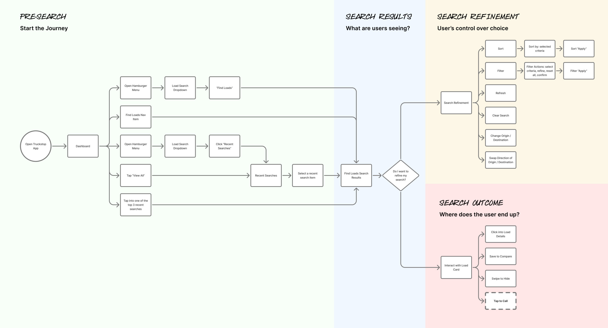
Execution: Load Search Design
Designing the search experience required balancing density with clarity. Carriers needed to quickly enter search criteria, apply filters, scan results, and review details, all in a mobile-first flow.
I worked closely with our external design partner to refine the end-to-end process. Search inputs and filters were designed to feel lightweight. Results highlighted the most important decision points on each card. Load details provided the full context without overwhelming the main results.


Roadmap Alignment
The project followed a Phase 1 roadmap that staged delivery sprint by sprint. Authentication and dashboard came first. By Sprint 5, search and details were in place. By Sprint 10, advanced features like Truck Posting, Rate Insights, and Book It Now were ready for approval.
This roadmap grounded the team, ensuring that parity came first while leaving space for future innovation.


Feedback in Motion
I designed the in-app Pendo guides for the beta, creating pop-ups that asked carriers about ease of use, clarity of load details, and adoption intent. I also governed Pendo guides across the company to keep them consistent and aligned with product priorities.
I used Pendo tracking data to uncover how carriers searched, where they tapped, and where they experienced friction. These insights, combined with survey responses, informed design refinements and validated our load search workflow.
Key contributions:
- Designed nearly all mobile Pendo guides
- Governed guide releases company-wide
- Leveraged tracking data and survey feedback to gain insights and further refine the app
Feedback Results
Easy Search
80%
Most carriers said the new search worked well.
Booked a Load
69%
Carriers valued being able to search and book loads while mobile.
Clear Details
91%
Carriers reported that load information was clear and scannable.
Would Recommend
79%
Most carriers said they would recommend Truckstop Go to a friend.
Additional Insights
- Many carriers experienced slow search results, leading to frustration.
- Some carriers said there weren’t as many search filter options as there are on the web app
- Some carriers also shared feature ideas they’d like added in the future.
Takeaways
The beta highlighted performance gaps that needed to be addressed before GA. It also revealed low-effort design tweaks we could act on quickly.
Outcome
Truckstop Go launched as the company’s first native mobile app, delivering parity for the core load board features carriers depended on most. Adoption told the story: 60,000 carriers onboarded in the first month, and 150,000+ by the end of the first year.
By focusing on parity first and usability always, Truckstop Go built trust among carriers who had been hesitant to move off desktop. Over time, the mobile team became known as one of the fastest and most efficient at delivering features. In some cases, functionality reached mobile before desktop, reflecting how the strong foundation and efficient cadence allowed us to move quickly once services were in place.

Reflection
This project reinforced the value of a strong foundation. By contributing to our design cadence, I helped shape a rhythm that gave the team speed without losing alignment.
Early on, we struggled with timelines and often snapped back and forth in direction. Through trial and error, we learned to iterate not only on design work, but also on how we worked together. Each cycle improved our alignment and built more confidence in the process.
For me, the biggest takeaway was how much influence iteration can have beyond the screen. Applying design thinking to collaboration itself created a healthier process and a team that could deliver quickly and confidently.